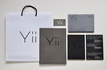
Yii identity
Dec 02, 2011
Logos
Andrew Wong
Taipei, Taiwan
National Taiwan Craft Research Institute
Taiwan
A very subtle and minimal exhibition Identity commissioned by National Taiwan Craft Research Institute. Yii - An on going exhibition featuring collaboration works of 15 Taiwanese designers and 20 Taiwanese traditional craftsmen. opening at Triennale di Milano this year. Organized by Creative director Gijs Bakker. The Concept "Yii" (易) - pronounced as the letter E - Taking from the classic text I-Ching (易經) , also known as the Book of Changes. The logo mark design, as requested by creative director Gijs Bakker (co-founder of Droog Design) , need to be very simple and not looking too much like a logo. We decided that a pure minimal typographic approach would work. Avant Garde extra light was selected for its geometrical simplicity. We modified the strokes and spacing as a subtle reference to a Trigram figure marking from the bāguà (八卦) symbol; mimicking one of the eight possible trigrams of the I-Ching, ☶ (The solid line represents yang. The open line represents yin)
Wrong or incomplete information? Let us know!


